Outcome
A centralized dashboard that simplifies how dealership managers track and act on their lead pipeline, approved by stakeholders with minor adjustments.
Client Overview
360.Agency provides a suite of digital retailing solutions for car dealerships, including their CRM tool. They wanted to create a centralized dashboard where dealer managers, sales team and BDC agents can follow up on the lead-to-customer journey.
Goal
Design a centralized dashboard to help dealership staff monitor and manage key activities and performance metrics with real-time tracking, monthly revenue insights, KPI-driven overview, departmental analytics, and role-based personalization.
Role
Lead UX Designer: Collaborated in user research, completed comparative analysis, ideated wireframes, and created high fidelity prototypes to present to stakeholders.
Problem
Team members at the dealership lacked a unified platform to manage their daily operations and track performance. They needed a customizable tool that could display essential data, such as appointments, sales metrics, and task statuses, all in one place.
In the absence of a centralized solution from our side, many users began turning to competitor tools, which impacted client engagement. Our goal was to provide a comprehensive dashboard that offered cross-department visibility and empowered users to make informed, data-driven decisions.
How might we:
- Help dealership teams streamline their daily operations through a centralized and intuitive dashboard?
- Enable better visibility and alignment across departments through a shared performance tracking tool?
Research
User Interview: Sales Manager Insights
To understand daily challenges within the dealership, I interviewed a Sales Manager supervising multiple sales representatives.
Key findings:
- Need for visibility: The manager lacked a clear overview of team and individual performance.
- Difficulty accessing data: Retrieving relevant sales metrics required too many steps.
- Lack of real-time insights: Without up-to-date data, adjusting sales strategies or redistributing leads was slow and reactive.
These insights highlighted the importance of a dashboard that delivers instant, actionable information at both individual and team levels.
Competitive Analysis
Some clients had begun migrating to other CRM solutions, so our goal was to understand what competitors offered that users valued most. We analyzed three major competing dashboards, focusing on:
- Data visualization approaches (clarity, density, and visual hierarchy)
- Customization and filtering options
- Performance indicators and trend reporting
This analysis helped us identify opportunities to simplify our data presentation and introduce benchmark indicators that users could interpret at a glance.
Define the Persona

Jonathan
42, Montréal, Québec
Role: Sales Manager
Bio
Jonathan has worked in automotive sales for over 10 years. He manages a medium-sized team at a busy dealership and is responsible for meeting aggressive sales targets. He relies on data to make informed decisions but currently struggles with fragmented systems that slow down his workflow. Jonathan needs a reliable and customizable CRM dashboard that helps him save time, improve team performance, and focus on high-priority actions.
Goals
- Monitor the daily and monthly performance of the sales team
- Track KPIs such as cars sold, revenue, and appointment success rates
- Quickly identify underperforming areas to take timely action
Frustrations
- Switching between multiple tools to compile reports
- Lack of real-time data visibility
- Inability to personalize dashboards to focus on specific team members or metrics
Needs
- Clear, at-a-glance performance overview
- Intuitive navigation with helpful filters
- Ability to customize views by team member or time period
Research Findings & Proposed Solutions
Research & Alignment: I began by organizing requirements with the product owner and mapping out what data needed to appear on the dashboard. Early on, I sketched multiple layout options with the goal of keeping it visual and concise, minimizing scrolling.
User & Stakeholder Feedback: When we tested early sketches with a sales manager, we learned that complex graphs created confusion rather than clarity. This insight pushed me to simplify the design and prioritize figures in cards over heavy data visualizations.
Design Decisions
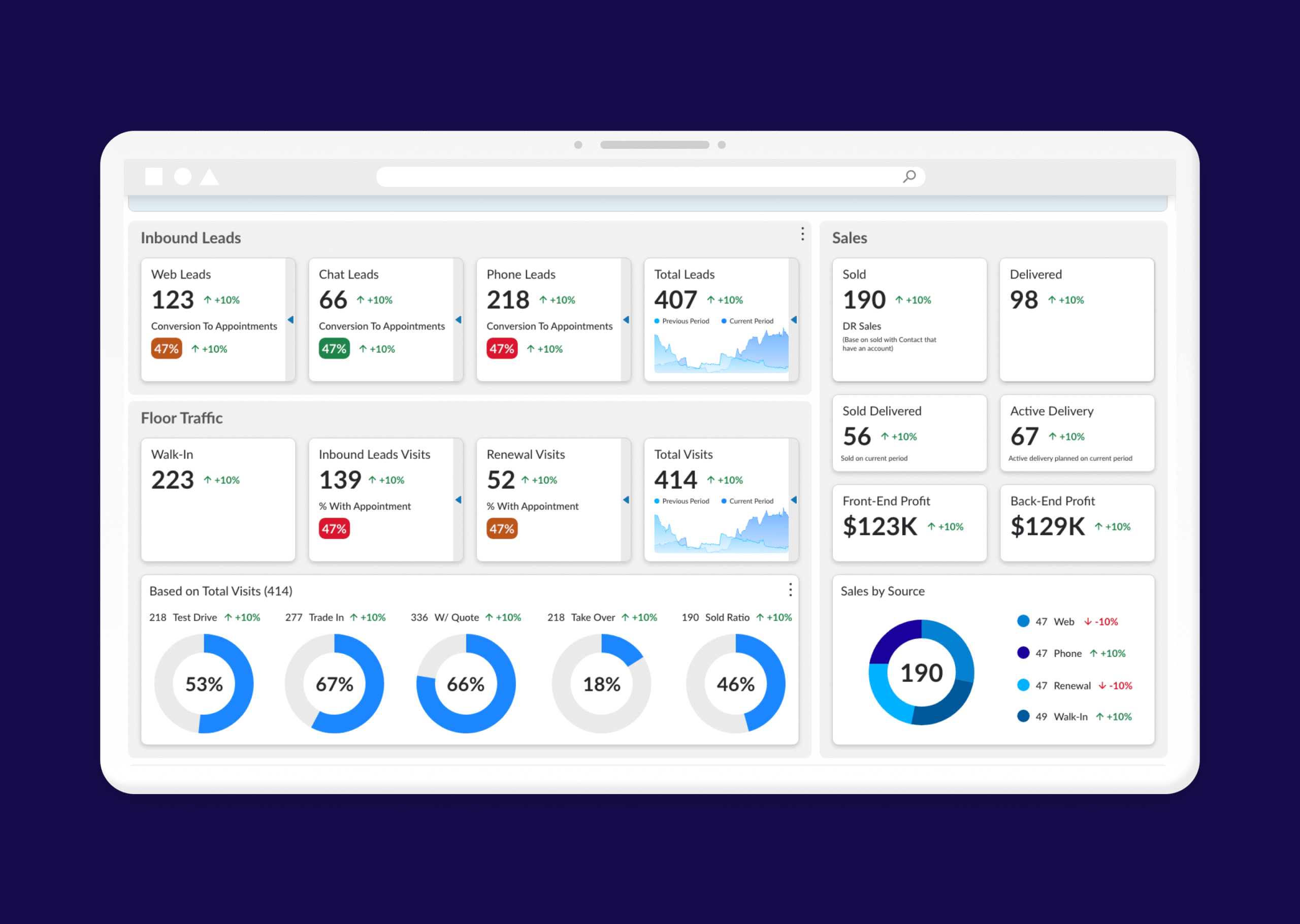
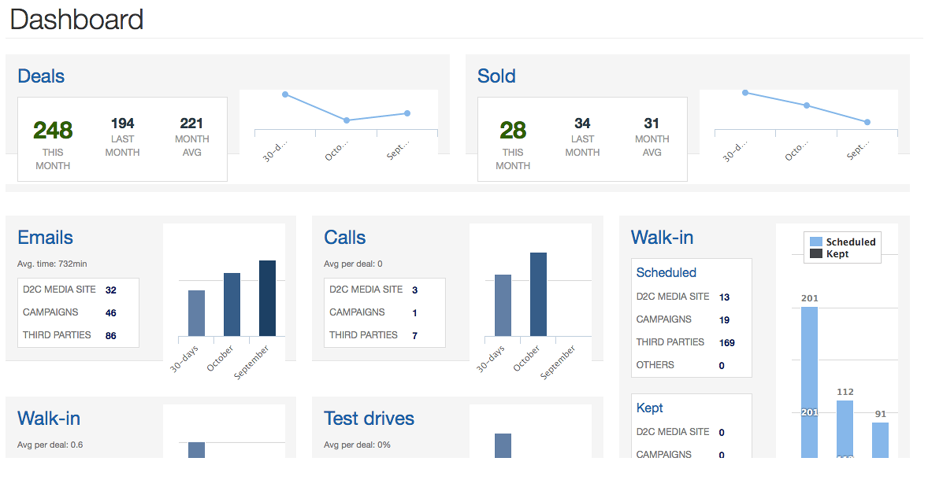
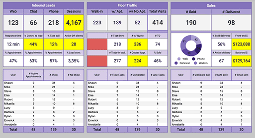
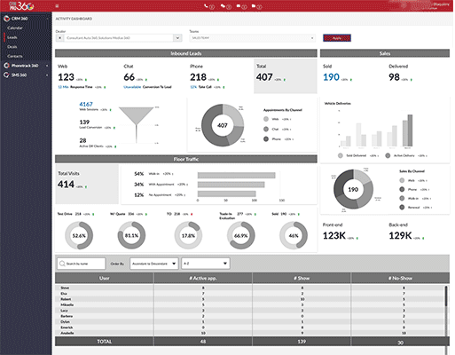
1. Information Hierarchy & Layout: To reduce complexity, I prioritized key figures over dense visualizations. Each card presents a single, high-value metric, while secondary data can be revealed on demand through a drawer or flip interaction, maintaining clarity without losing depth.
2. Security, Roles & Permissions: Given the sensitivity of sales data, I defined role-based visibility rules within the design:
- Sales Managers can access full team performance data and comparative analytics.
- BDC Agents and individual sales representatives only see their own metrics.
This approach supports data privacy and aligns with organizational hierarchies while keeping the interface intuitive for every role.
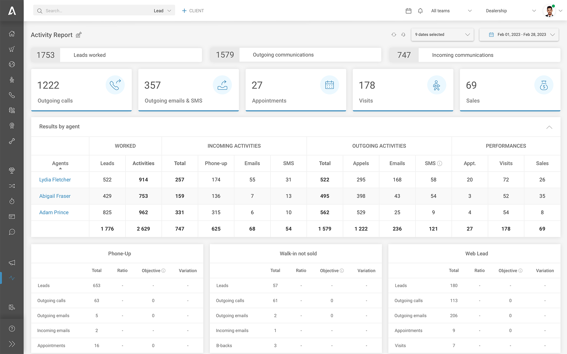
3. Search & Filtering: To make data exploration effortless, I introduced advanced search and filtering capabilities, allowing users to quickly locate specific information (e.g., by salesperson, dealership, or time period) and track individual and team performance with minimal navigation effort.
4. Performance Metrics & KPIs: To support performance management, I defined key indicators such as conversion rates, total sales, and visits. Each metric uses visual status cues (green = above target, orange = on track, red = below expectations) to help managers assess team effectiveness at a glance.
5. Trend Visualization: A lightweight graph displays 30-day progression and month-over-month comparisons for total sales and dealership visits, offering quick insights into trends without overwhelming users.
6. Product Integration & Conditional States: Since the CRM connects to a broader suite of dealership tools, the dashboard adapts to available data. If certain products are inactive, a contextual message informs users how to access or enable those features.
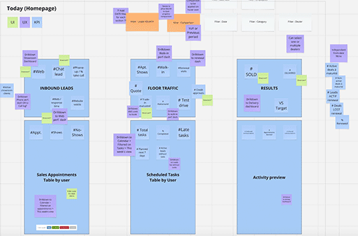
Ideation process and sketches
Presentation to Stakeholders
After a month of prototyping, I presented the dashboard designs to a group including sales managers, product owners, and executive stakeholders.
- The focus of the presentation was to validate information hierarchy and placement.
- Stakeholders appreciated the clarity and simplicity of the design, and the overall concept was approved with only minor adjustments needed.
- This step confirmed that the direction aligned with both business objectives and user comprehension.
High Fidelity Prototyping
Collaboration & Iteration: Throughout prototyping, I worked closely with developers to validate feasibility and adjust designs as needed. Their feedback helped refine interactions (like the flip/drawer effect) while keeping implementation practical.
Handoff to Developers
Following approval, I prepared a detailed handoff package that included:
- Wireframes and interactive prototypes in Figma
- Documentation of different usage scenarios: All features active, Partial product availability (inactive modules), Data limitations (e.g., "comparison to last month" not available)
- Notes on interactions, behaviors, and conditional states to ensure a smooth implementation
I also scheduled working sessions with developers to review edge cases and gather technical feedback, which helped refine small details early and avoid rework later.
Future Considerations
Keep running user testing for role-specific customization and expand analytics features based on user feedback.