EdCuration-productpage-mockup

Navigation Re-Design

For an Educational Resources Marketplace

PROJECT SUMMARY

Scope: User Research, User Testing, Prototyping
10 Weeks 

Tools: Figma, Miro, Zoom

Client Overview

EdCuration helps educators find the educational resources they need to support their students by complying with curriculum standards. Simplifying the procurement process for educators and connecting them to vendors who are innovative, and offer authentic learning opportunities for kids in a single marketplace.

Goal

Design an effective and intuitive way for educators to navigate the marketplace, find, research, select and order instructional resources, while also being able to raise the conversion rate through the CTA’s.


Role: Product Designer

In a team of 4, I collaborated in the user research phase by completing the comparative analysis to upgrade the website’s features, collaborated conducting interviews and user testings to understand the educator’s background and behavior, ideated low fidelity wireframes proposing possible solutions, and created high fidelity prototypes to present to the client. Also created the bases of a design system applied to the final design.

Team

Carla Orellana: UX Designer
Sandra Gomon: Project Lead Designer
Michelle Clayborne: UX Researcher
YC Wang: Information Architect

Problem

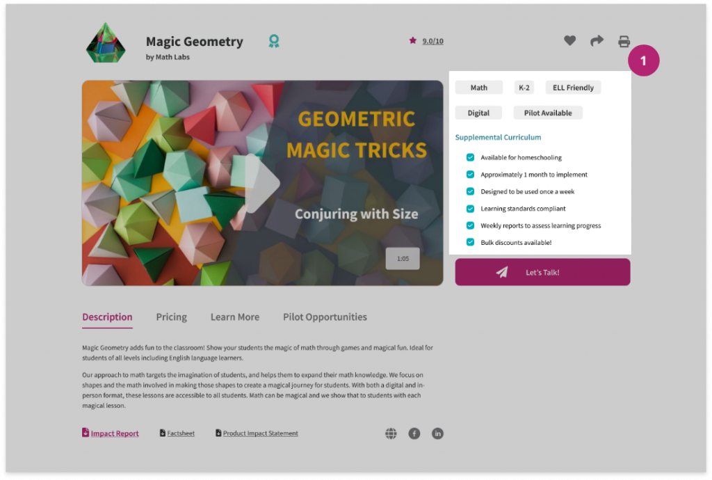
Educators need to find resources that comply with curriculum, find a clear and detailed product description while also being able to share the selected resources with their colleagues and school board. Educators log into EdCuration to look for these resources, how ever, more often than not, they don’t convert by clicking on the CTA’s.

EXPLORING OPPORTUNITIES

How might we…

  • Help educators find instructional materials quickly & efficiently
  • Help involve their colleagues and/or principals in the process of selecting a resource

QUALITATIVE & QUANTITATIVE

RESEARCH

To stay within our scope, the focus of the research was on the filtering system and product detail page, the last one being a critical part on why educators were not clicking on the intended CTA’s. To find out that, we did:

  • A Heuristic Evaluation to get a general perspective on the site’s navigation.
  • A Comparative Analysis to improve our existing filtering system and conversions in the product page.
  • Interviews and Usability Testings were perfomed to confirm or refute our assumptions about educators and get their feedback on the actual site’s navigation, filtering system, and product detail page.

Heuristics

We observed that the search page results and product page had some contrast and hierarchy issues.

  • The information was hard to find due to a lack or hierarchy in the product detail page.
  • Most of the pages titles were grey on white, which made the reading not accessible.

Comparative Analysis

I compared different sites that offer educational resources as well as other types of marketplace websites, getting some ideas on what to include in our design.

Interviews & 1st Round of Usability Testings

The first user interviews & user testings were conducted with teachers and curriculum directors around the US.

60% use the favourite button

75% did not use the intended CTA’s

50% found pricing unclear

60% did not see the pilot opportunities

DEFINE

EDUCATOR’S PERSONA

Sarah teacher persona

Sarah Leclerc

Science Teacher,
New Jersey, USA

Bio

Meet Sarah, a 42 years old high school science teacher working for a mid-size public school in a nice suburban school district.

Every summer Sarah and her colleagues explore the curriculum options that could fit the budget they are given and share their options to find a perfect solution for their students.

frustrations

Constraints

She spends a lot of time researching resources online, and she struggles to find support documents to convince the school board to approve the budget.

goals

Goals

Sarah wants to find resources that fit her students’ needs and be able to pitch her choices to the school board.

motivations

Motivations

Sarah feels motivated by tools that can help her narrow down her choices and access support documents easily.

RESEARCH FINDINGS & PROPOSED SOLUTIONS

After completing our research and defining who our user was, the conclusions were presented to the stakeholders to agree on
the design direction.

#1. Search results are not always relevant, leading to confusion.

  • Add tags to product tiles describing their categories 

#2. Information is inconsistent from product to product.

  • Create a template to be filled by the vendor when they create a new product

#3. Users don’t tend to click on CTA’s.

  • Work on the hierarchy of elements through the page.

#4. Pricing details were missing.

  • Enable a way for educators to calculate the pricing according to budget

PROTOTYPE & TEST

Homepage mid fidelity

Homepage

Educators search from the homepage filter, we’ve preselected the subject, this is done according to the educator’s profile.

Before they click on “Browse Resources” they can narrow down their search by selecting grade and type of resource.

Results Page

Filters remain at the left, but this time they also show what the user have selected.

Product tiles were improved adding key information in tags like: Main subject, grades and rating.

Product Detail Page

The default tab open is the product description, we also added key information like reviews, pricing, and pilot opportunities (if offered).

We added sharing option at the top.

We defined a main CTA so educators know exactly where to click to contact the vendor.

2ND ROUND OF USABILITY TESTINGS

Another round of testing was conducted but now with our mid-fidelity prototypes. As we asked educators to perform the tasks, we found out the following:

  • Sharing resources with a colleague: 80% of the users asked to share the resource, used the sharing button option at the top. They mentioned their preferred method for sharing is email.
  • “Let’s Talk” CTA: All of them said they would use the CTA if they needed further information.
  • Pricing information: All of them found the pricing tab, and one of them added that they would ask for an instant quote if they had a budget already.
  • Reviews: We decided to move the reviews tab to the bottom because we found most products don’t have reviews yet and this tab would be found empty most of the time.

FINAL DESIGN

EDCURATION’S NEW NAVIGATION

Research & Filter

homepage-dropdown-filter

Filter Dropdown at Homepage

Educators can start filtering their search from the homepage. We know EdCuration is a marketplace and we want it to make it obvious for educators since they land. A filtering option at homepage is a common feature to find in any marketplace site, and after our user testings we found out educators had less extra steps to go through while looking for a resource.

FINAL DESIGN

EDCURATION’S NEW NAVIGATION

Research & Filter

Filter Dropdown at Homepage

Educators can start filtering their search from the homepage. We know EdCuration is a marketplace and we want it to make it obvious for educators since they land. A filtering option at homepage is a common feature to find in any marketplace site, and after our user testings we found out educators had less extra steps to go through while looking for a resource.

homepage-dropdown-filter
search-results-page

Selection Box in Search Results

Educators had no way to know what they just look for, and as we stated before, some of them were confused on what they’ve just selected. We added this feature as a way to reassure them on what filters they’ve selected, this way, instead of going through all the filters and unselecting them, they could just go here and click on the select filters to remove them.

Tags in Product Tiles

“I thought I’d picked Science”

On our user testings, we identified that one-third of educators felt confused about the products that were shown on the search results. We inquire about the relevance of how products were displayed and we found out some products serve for 2 or more subjects. So we included only the main subject in a tag to make clear what the resource was about and we improved the previous product tiles by adding more information about the product such as grades and rating.

Product Detail Page

Sidebar Information

1. Main information on sidebar

Once educators land on the product page, they need to make a decisions about what to do next. Is this resource suitable for ELL? Can I use it for homeschooling? Does it provide a sample? What if I need more information?

We changed the previous sidebar to add key information that would help educators make better choices, addressing the hierarchy problem.

2. CTA

We added a main CTA where Educators can ask for more information. We can gladly say that by reducing the amount of CTA’s and organizing the information in the product detail page, our rate of conversion grew by 80%.

CTA on sidebar
Share option

3. Save / Share / Print /

When Educators find a resource they want to purchase, they are often not alone in the decision-making. They need to pitch these resources to their colleagues and school board, so we added a way for them to print and share the resources. This feature was used by 75% of the educators.

4. Tabs

When we performed our first user testing, we found that our users struggle to find information about pricing, sample lessons, and support documents. We wanted to simplify finding the information they needed by organizing the content into tabs. In the 2nd round of user tests, we were glad to see that educators could easily find this information when asked.

Instant Quote
search-results-page

Selection Box in Search Results

Educators had no way to know what they just look for, and as we stated before, some of them were confused on what they’ve just selected. We added this feature as a way to reassure them on what filters they’ve selected, this way, instead of going through all the filters and unselecting them, they could just go here and click on the select filters to remove them.

Tags in Product Tiles

“I thought I’d picked Science”

On our user testings, we identified that one-third of educators felt confused about the products that were shown on the search results. We inquire about the relevance of how products were displayed and we found out some products serve for 2 or more subjects. So we included only the main subject in a tag to make clear what the resource was about and we improved the previous product tiles by adding more information about the product such as grades and rating.

Product Detail Page

Sidebar Information

1. Main information on sidebar

Once educators land on the product page, they need to make a decisions about what to do next. Is this resource suitable for ELL? Can I use it for homeschooling? Does it provide a sample? What if I need more information?

We changed the previous sidebar to add key information that would help educators make better choices, addressing the hierarchy problem.

CTA on sidebar

2.CTA

We added a main CTA where Educators can ask for more information. We can gladly say that by reducing the amount of CTA’s and organizing the information in the product detail page, our rate of conversion grew by 80%.

Share option

3. Save / Share / Print /

When Educators find a resource they want to purchase, they are often not alone in the decision-making. They need to pitch these resources to their colleagues and school board, so we added a way for them to print and share the resources. This feature was used by 75% of the educators.

Instant Quote

4. Tabs

When we performed our first user testing, we found that our users struggle to find information about pricing, sample lessons, and support documents. We wanted to simplify finding the information they needed by organizing the content into tabs. In the 2nd round of user tests, we were glad to see that educators could easily find this information when asked.

HIGH FIDELITY PROTOTYPE

Link to Prototype

STYLE GUIDE

With the mid-fidelity prototype completed, I was assigned to create the bases for a Design System for the site. I took the previous EdCuration color palette and created a set of components that would follow the web accessibility standards.

Design System EdCuration

FUTURE CONSIDERATIONS

  • Find a way to get more reviews on resources from educators
  • More usability testings
  • Improve the user dashboard
  • Login/Sign up via Social Media
  • Add the Edreports reviews on product page