Vehicle Detail Page Showroom Re-desing
Outcome
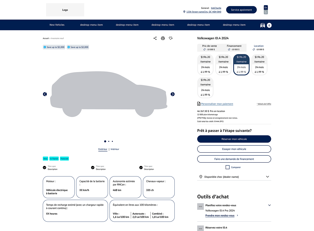
Delivered a fully tagged, mobile-optimized VDP with a Payment Calculator featuring EV and government rebate logic, and a dedicated EV Module, expanding the original scope to address pricing transparency and EV buyer needs.
Client Overview
360.Agency provides a suite of digital retailing solutions for car dealerships across Canada, including their online Showroom platform. The redesign targeted their Vehicle Detail Page to improve lead generation and reduce dealer support overhead.
Goal
Design a user-friendly Vehicle Detail Page that guides users through the car-buying journey and drives lead generation, mobile-optimized and compliance-ready across provinces.
Role
I contributed to both the UX and UI research phases, starting with a competitive analysis to identify conversion opportunities. Working closely with the Product Owner, I navigated compliance requirements from manufacturers and provincial regulations. I also led the wireframing and prototyping of a scalable VDP layout adaptable across multiple automotive brands in Canada.
Problem
The existing Vehicle Detail Page was cluttered and difficult to navigate. Users struggled to find key information, which impacted engagement and lead conversion. The platform also lacked mobile optimization and had no lead tagging, meaning no visibility into which touchpoints were driving conversions. As a result, lead quality was unpredictable, and dealers and support teams were overwhelmed with showroom-related tickets.
How might we:
- Help users easily navigate the VDP to find relevant information about a specific vehicle?
- Enable dealerships to increase conversions through a more intuitive and action-oriented detail page?
- Present pricing, rebates, and payment options transparently, especially for EV buyers across different provinces?
- Reduce dealer support overhead by designing a self-serve experience that answers common questions upfront?
Project Targets
Defined by the Product Owner and VP of Product Development at project kickoff. These informed the design direction and were not tracked or reported on by the UX team.
Performance / Conversion:
- 20% increase in total monthly leads vs. baseline
- ≥40% of submissions qualify as sales-ready leads
Operational Efficiency:
- 30% decrease in showroom-related support tickets
- ≥90% of tickets carry a clear source attribute via tagging
User Experience:
- Mobile-optimized VDP with conversion-focused layout
Research & Findings
Competitive & Comparative Analysis
To understand user expectations and identify design gaps, I analyzed VDP patterns across major automotive manufacturer sites including Hyundai, Mazda, and Toyota. Research focused on five key dimensions:
- Payment Options: How incentives and EV rebates are surfaced, particularly given province-specific pricing complexity.
- Protection Plans & Accessories: Integration of add-ons into the layout and payment display.
- Payment Calculator: How sites let users estimate total costs across APR, term, trade-in, and taxes.
- Payment Summary: Clarity of the total cost breakdown including accessories and plans.
- Buying Journey: Whether experiences used multi-screen flows or single-page layouts, and what drove completion.

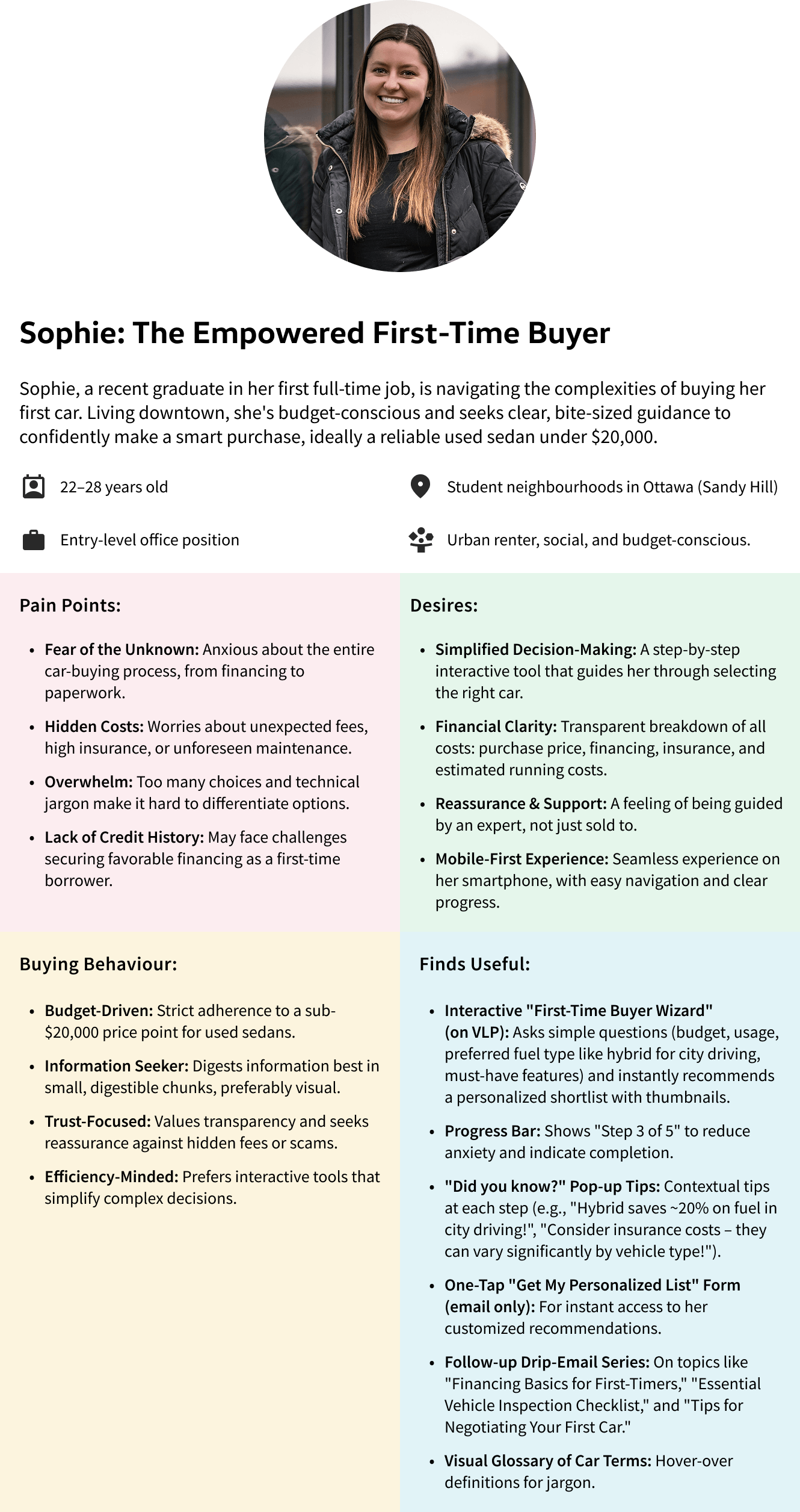
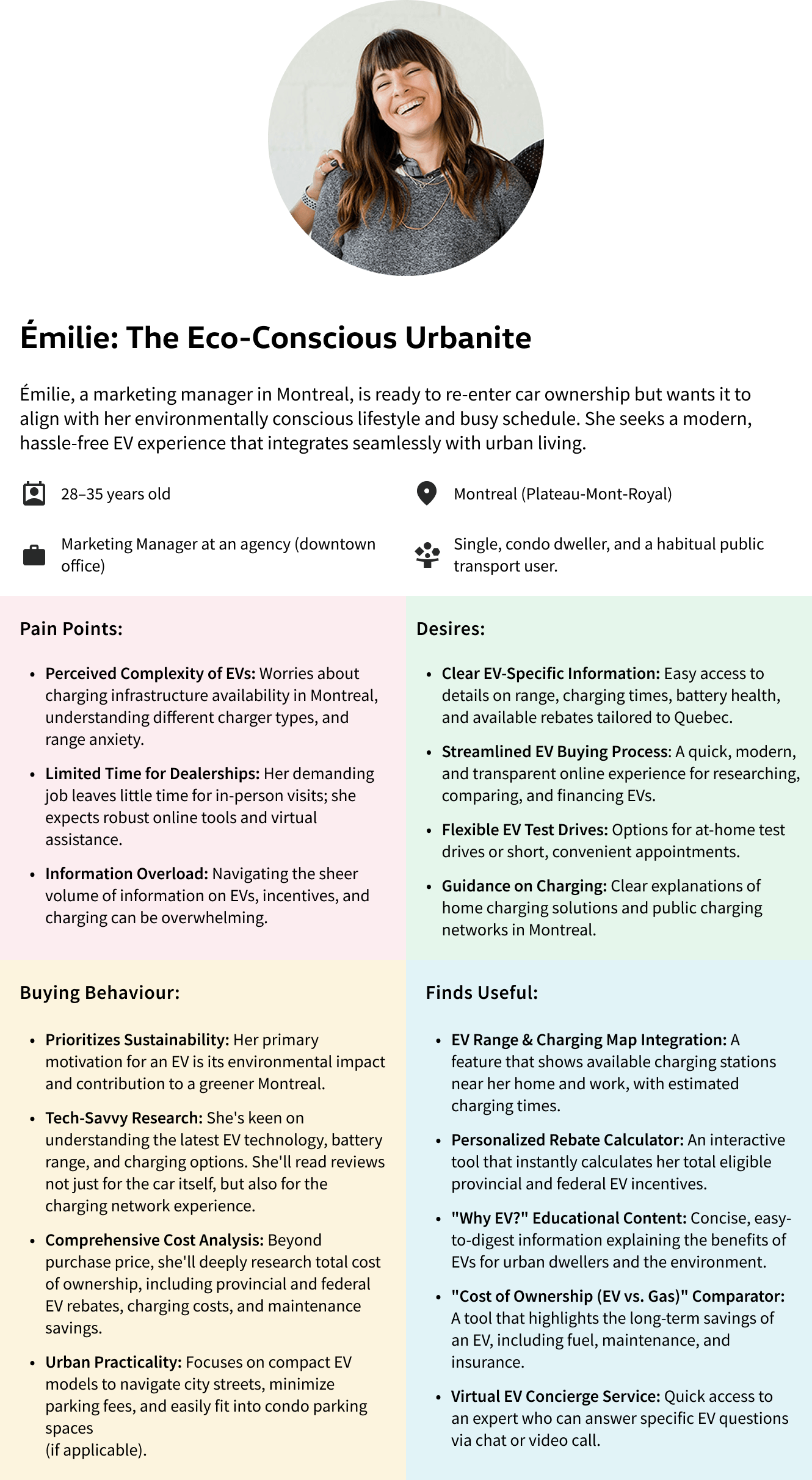
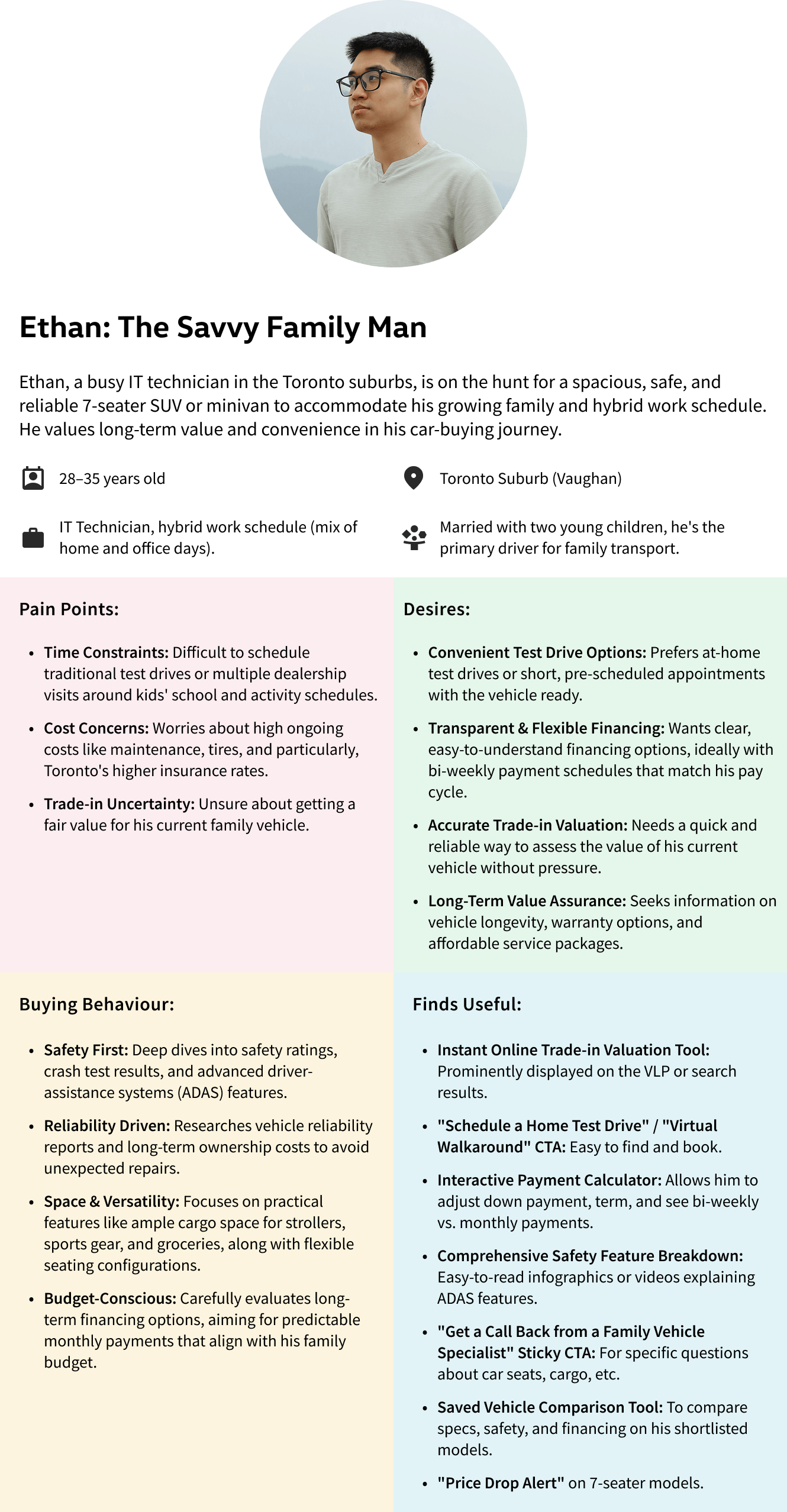
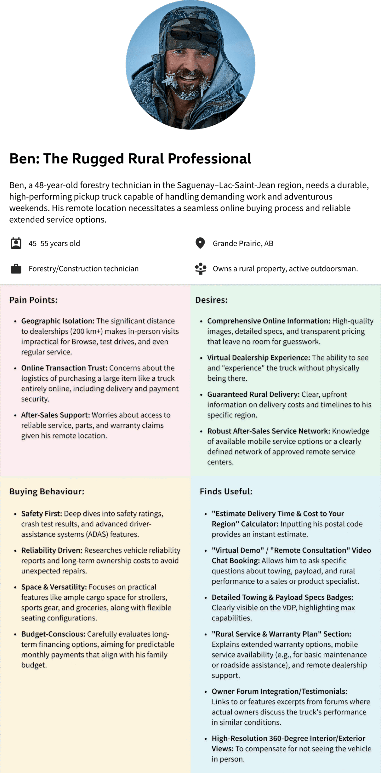
Personas
Four distinct user personas were developed through the VLP/VDP discovery process, each representing a key segment of the Canadian automotive buyer audience. These informed both the VDP content hierarchy and the new Payment Calculator and EV Module designs.
Key Research Findings & Design Decisions
#1 Cluttered Layout Disrupted the Buying Journey
Key vehicle information and CTAs were scattered, making it hard for users to maintain a reading flow or know where to take action.
Solution:
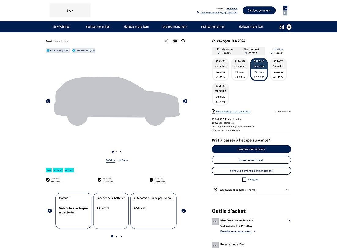
Centralized vehicle content in a main content area with a fixed sidebar for payment options and CTAs. Added a sticky header with core vehicle info and two primary CTAs to maintain orientation while scrolling.
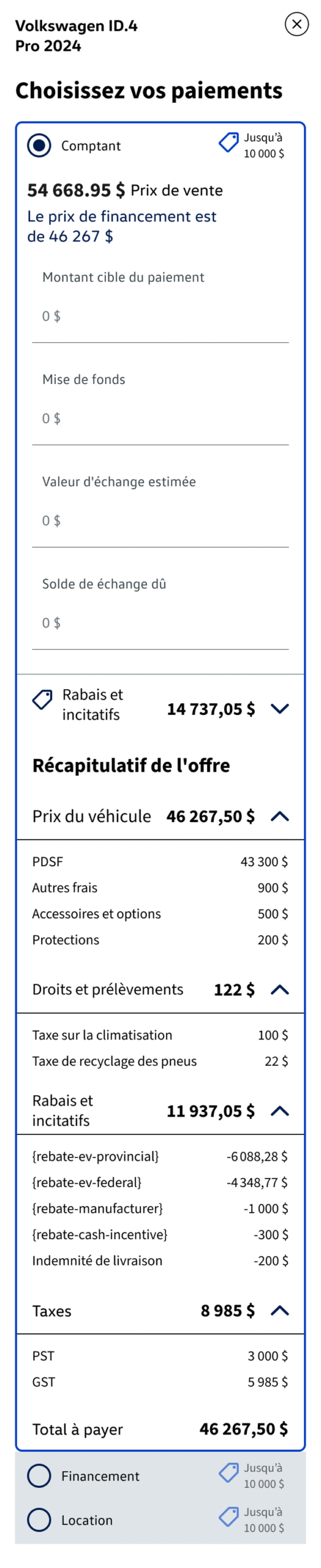
#2 Pricing Lacked Transparency, Especially for EVs
The price breakdown failed to differentiate pre- and post-tax amounts or communicate EV incentives clearly, creating confusion and compliance risk across provinces (AMVIC, OMVIC, SAAQ).
Solution:
Applied a broad-to-narrow compliance research approach across provincial guidelines. Implemented a structured payment calculator with visible rebate logic and clear pre/post-tax breakdowns.
#3 EV Buyers Needed Dedicated Information Architecture
EV-specific details, range, charging types, battery health, and available government rebates, were buried or absent entirely, failing users like Émilie who needed this upfront.
Solution:
Designed a dedicated EV Module within the VDP that surfaces key EV specs, visual badges, and rebate callouts as a standalone, scannable section, not buried in a spec table.
New Features in This Iteration
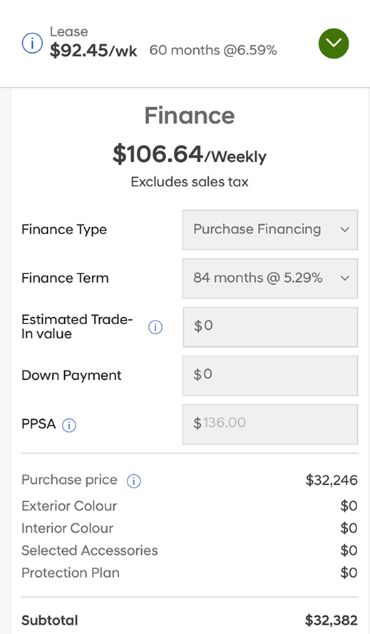
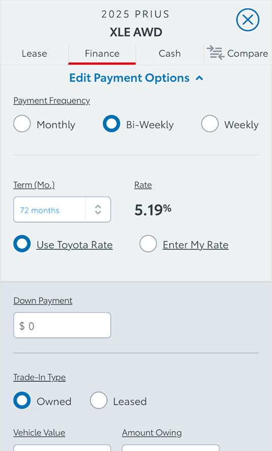
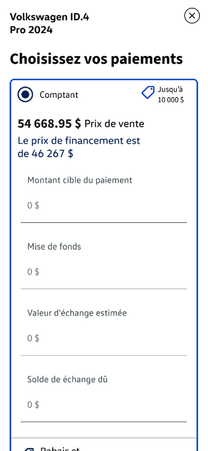
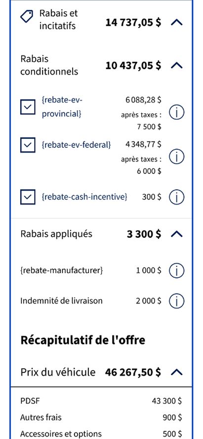
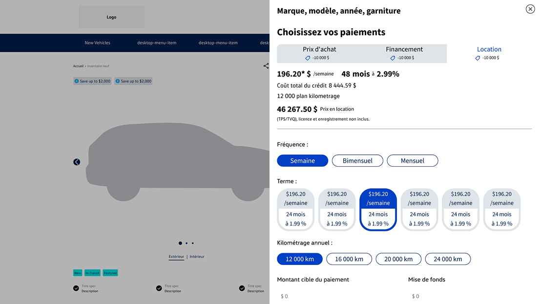
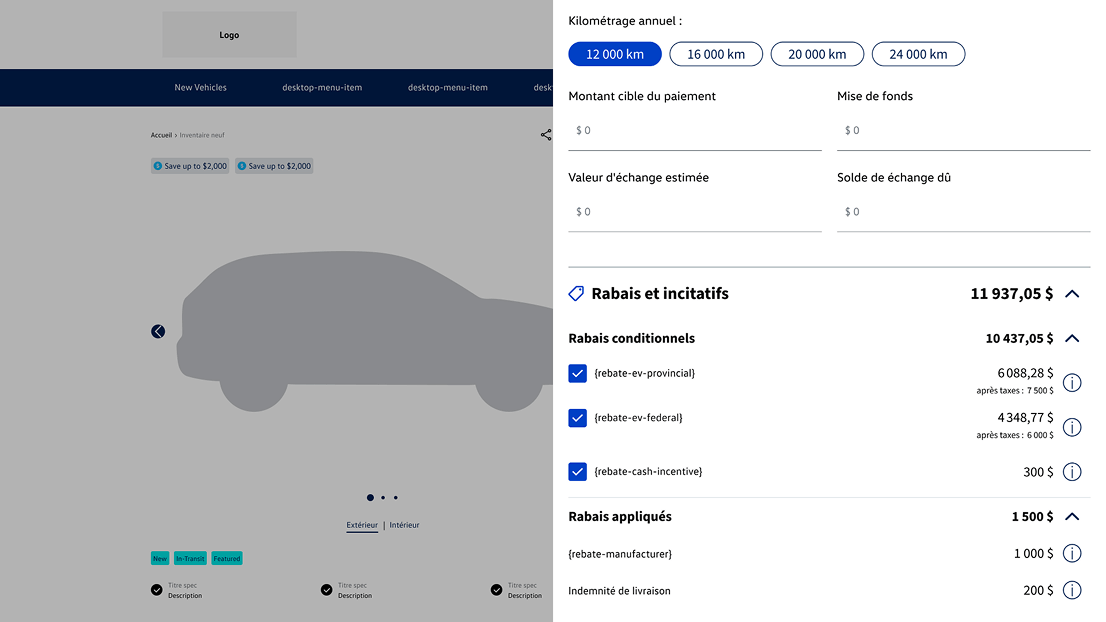
- Payment Calculator
The Payment Calculator was introduced as a direct response to user research showing that buyers, across all personas, needed transparent, flexible cost estimations before committing to contact a dealer.
What it does:
- Allows users to toggle between cash, finance, and lease payment modes
- Updates total cost dynamically as users adjust down payment, term, and APR
- Surfaces applicable rebates (EV-specific + government) based on payment type selected
- Includes an expandable Rebates section with clear descriptions per incentive
- Shows pre-tax and post-tax amounts to meet provincial compliance requirements
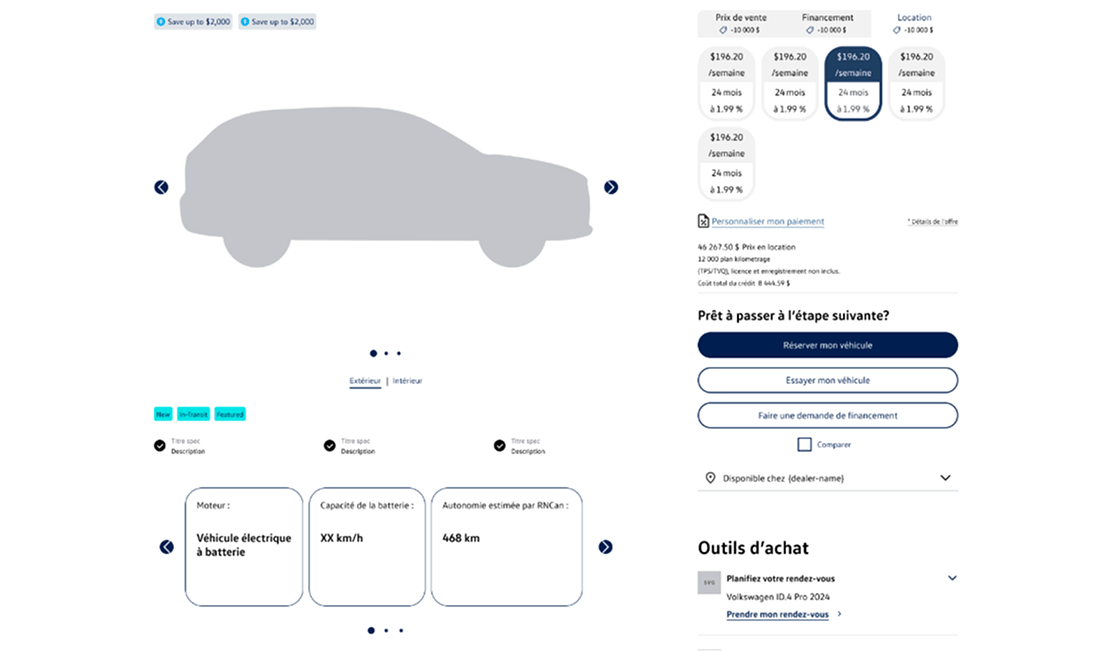
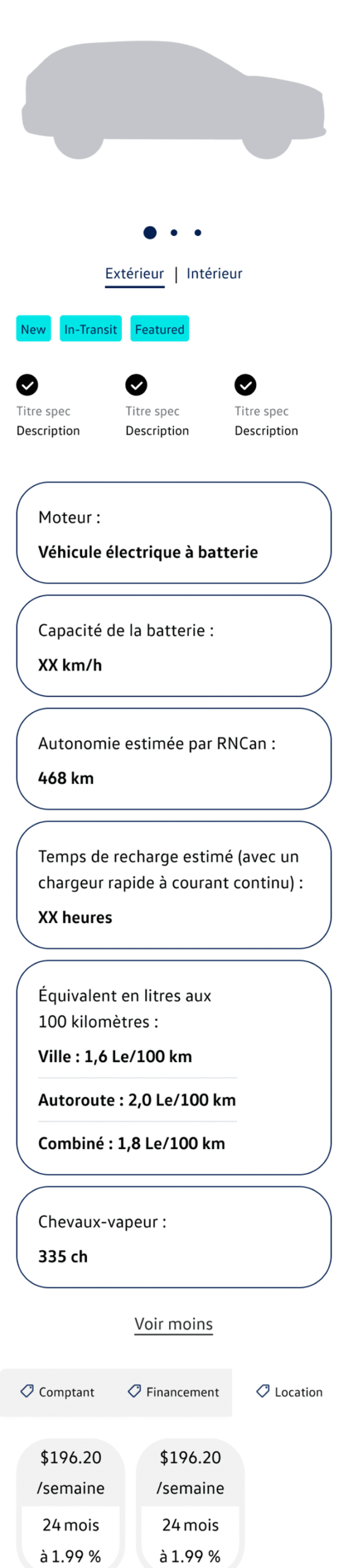
- EV Module in VDP
For EV listings, a dedicated content module was added to the VDP to address the specific information needs of environmentally-conscious buyers and remove the key barrier of "EV complexity" identified in user research.
What it shows:
- Range estimate (km) with visual indicator
- Charging port type and compatibility
- Estimated home vs. public charging time
- Battery size and warranty information
- Available EV incentive badges (provincial + federal)
- "Why EV?" educational callout for first-time EV buyers
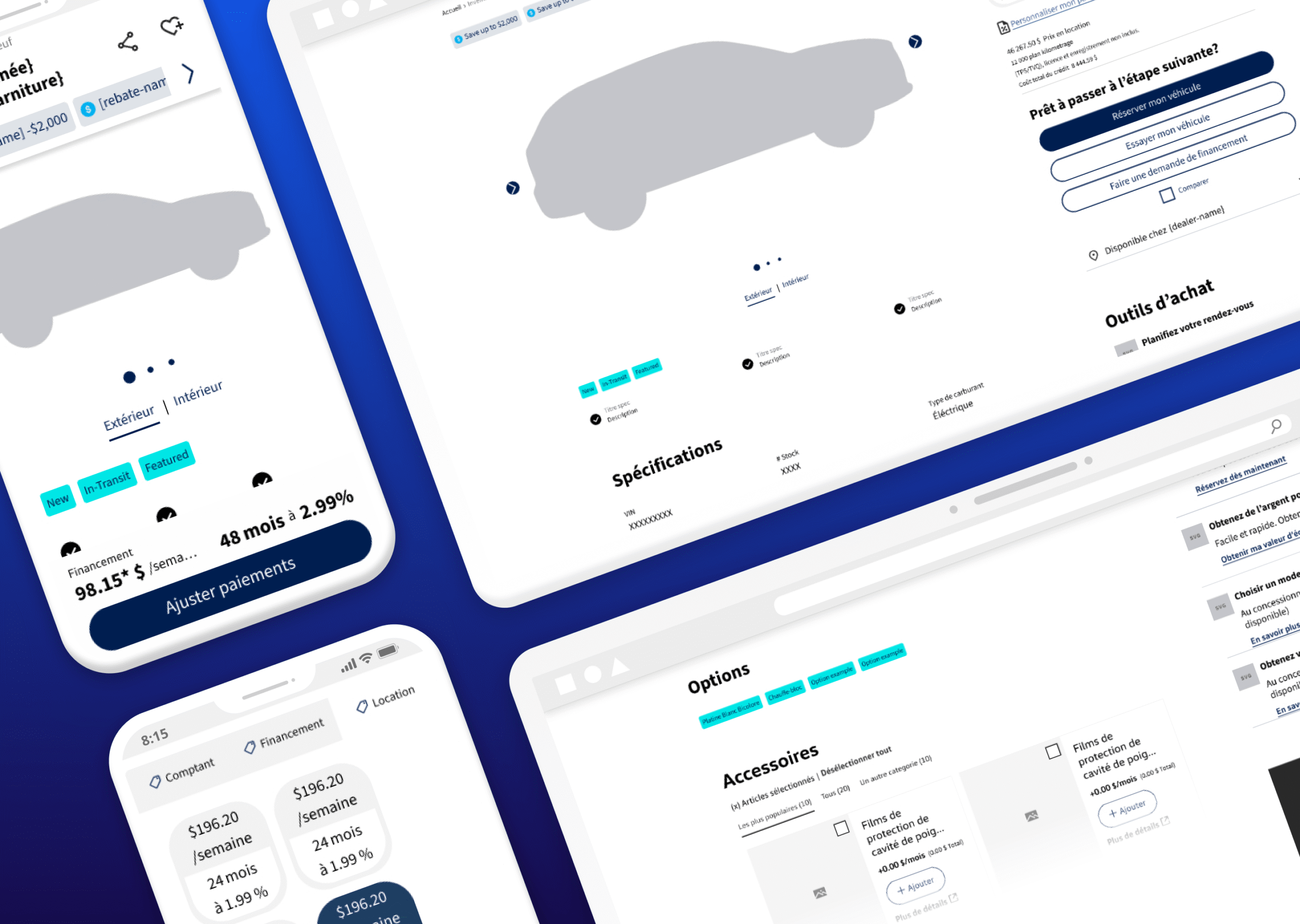
Prototypes
Mobile, High Fidelity
The mobile layout was designed with a focus on clarity and conversion, a streamlined single-column flow with a sticky CTA bar, inline Payment Calculator, and the EV Module surfaced above the fold on EV listings.
Desktop, High Fidelity
The desktop layout uses a two-column structure: vehicle content on the left and a fixed payment sidebar on the right. The sticky header persists on scroll with the vehicle name and two primary CTAs.
Learnings & Reflection
Under Exploration
- Behavioural analytics and heatmapping to validate scroll depth and CTA engagement
- Personalization based on user location, past searches, or vehicle type preference
- Trade-in valuation tool integration in the payment sidebar
Already Planned
- Conversion analysis on the redesigned mobile VDP layout
- EV Module user testing scored against clarity & appeal criteria
- EV badge standardization across all VLPs and VDPs